I used to think websites just needed to look good. Put up some nice images, maybe a contact form, and you’re done, right?
Then I started building them professionally.
Turns out, a website that looks fine on the surface can still be quietly driving away customers. Here are the 5 warning signs I now check for in every project – and if your site has even one of these, it’s time for a refresh.
Sign 1: Loading Speed is Slow
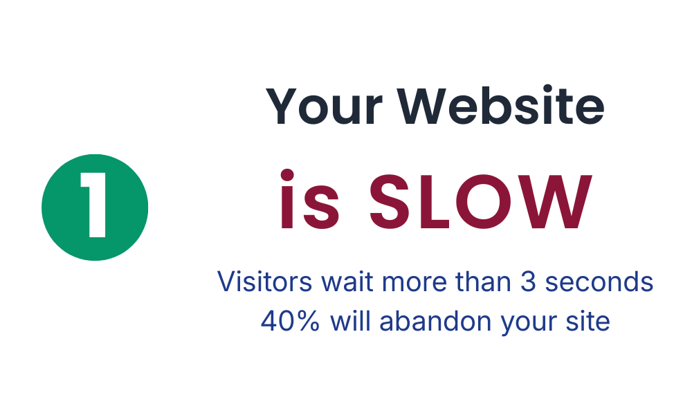
Here’s a stat that changed how I approach web development: 40% of people will abandon a website if it takes longer than three seconds to load. Three seconds. That’s barely enough time to blink twice.
When I built my first “real” website, I thought it looked great. Then I ran it through PageSpeed Insights and saw a score of 31/100. Ouch. That’s when I learned about Core Web Vitals – the metrics that actually measure what users experience.
Think of them like this:
- Largest Contentful Paint (LCP): How fast does your main content appear? Nobody wants to stare at a blank screen.
- Cumulative Layout Shift (CLS): Does your content jump around while loading? You know that annoying moment when you’re about to click a button and suddenly everything shifts? That’s high CLS.
- Interaction to Next Paint (INP): Does your site respond quickly when someone clicks or types? Slow, unresponsive buttons make users feel like the site is broken.
You can check your site’s performance for free using PageSpeed Insights. Fair warning: the results might sting a little (they did for me), but they’ll show you exactly what needs fixing.
Sign 2: It’s Not Mobile-Friendly
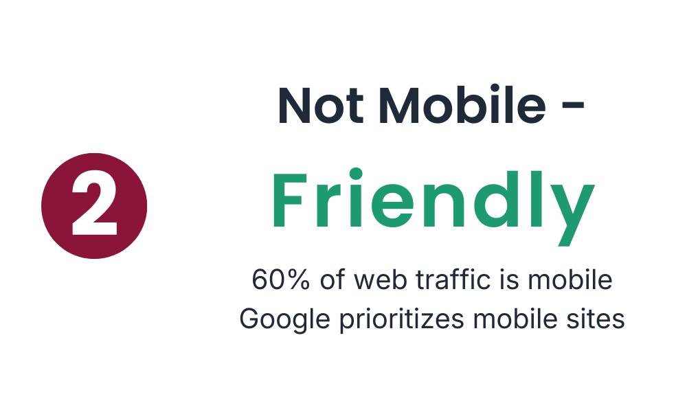
60% of web traffic comes from mobile devices. That means more than half your visitors are probably viewing your site on a phone right now.
I learned this the hard way when a client called me, frustrated. “The buttons don’t work on my phone,” she said. I pulled up the site on my laptop – looked perfect. Then I checked on my phone and… yeah. The buttons were tiny, the text required constant zooming, and the navigation was basically unusable.
If your site requires pinching and zooming to read anything, or if buttons are so small they’re impossible to tap accurately, you’re essentially hanging a “Mobile Users Not Welcome” sign on your digital door. And you’re turning away more than half your potential audience.
Sign 3: Outdated Design
Let me ask you something: does your website have gradient buttons? Carousel sliders that auto-play? A “Welcome to our website!” message at the top?
These design patterns were everywhere 10-15 years ago. Today, they make your site look abandoned.
Design trends evolve fast – sometimes too fast. But here’s the thing: outdated design doesn’t just look bad, it makes visitors question whether your business is still active. I’ve seen perfectly good companies lose credibility because their website looked like it hadn’t been touched since 2012.
Modern web design is clean, lets your content breathe, and gets out of the way. If your site feels cluttered or stuck in the past, that’s a clear sign it’s time for an update.
Sign 4: It Doesn’t Reflect Your Current Brand
Your business evolves. Mine certainly has.
Maybe you’ve expanded your services. Maybe you’ve found a new niche. Maybe your entire target audience has shifted. But if your website is still showing what you did three years ago, you’re creating a confusing disconnect for visitors.
I’ve worked with clients who kept outdated portfolios online for years because “we’ll update it eventually.” Meanwhile, potential customers would see old work that didn’t represent what the company actually does anymore.
Your website should grow with your business, not trap you in the past. If you find yourself explaining to people “Oh, we don’t actually do that anymore” when they mention something from your site – it’s time for a refresh.
Sign 5: Broken Functionality
Be honest: are you embarrassed to share your website link?
That gut feeling of “I’d better warn them that the contact form might not work” or “Maybe I’ll just send them my social media instead” – that’s your instinct telling you something’s wrong.
Broken links, navigation that leads nowhere, forms that don’t submit, images that won’t load – these aren’t just annoying, they’re deal-breakers. If users can’t do what they came to do, they’ll leave. And they probably won’t come back.
The good news? You don’t need to test with hundreds of users to find these issues. In usability testing, we often discover that testing with just five users reveals about 85% of usability problems. Sometimes you just need to sit down and actually try to use your own site like a first-time visitor would.
What to Do Next: Start Simple
Feeling overwhelmed? Don’t be. You don’t need to fix everything at once.
Start with the basics:
- Run a speed test – PageSpeed Insights will give you a clear score and specific suggestions
- Check your site on your phone – Actually navigate through it. Try to fill out your contact form. Be honest about the experience.
- Click every link – Make sure nothing leads to a 404 error page
- Ask someone else – Get a friend or colleague to try using your site while you watch (without helping). You’ll see problems you never noticed.
One quick win that consistently makes a huge difference? Optimize your images. I was shocked when I learned that switching to modern image formats like WebP can reduce file sizes by 25-30% compared to traditional JPEGs – with no visible quality loss. Smaller images = faster loading = happier users.
Conclusion
Looking back at my early web projects makes me cringe a little. Slow sites. Broken on mobile. Designs that screamed 2015. But that’s part of the learning process, right?
If any of these five signs sound familiar, don’t panic. I’ve been there. Start with one thing – maybe run that speed test, or really look at your site on your phone. Small improvements add up faster than you think.
Your website is often the first impression people get of your business. Make it count.
What’s your biggest website frustration right now? I’d love to hear about it – drop a comment below.